

Ask an AI coding agent for "a modern landing page" and you will get the same page everyone else gets. A centred headline, a soft gradient, three feature cards with icons, a pricing table, the same rounded corners. It works. It is also instantly forgettable, and anyone who has spent a week on the internet in 2026 can smell it.
That isn't the agent being lazy. It is the agent doing exactly what it was built to do. A language model writes the most likely next token, so when you give it a vague brief, it hands you the most likely website: the average of everything it has seen. Taste is a deviation from the average, and a model will not deviate unless you give it something specific to deviate towards.
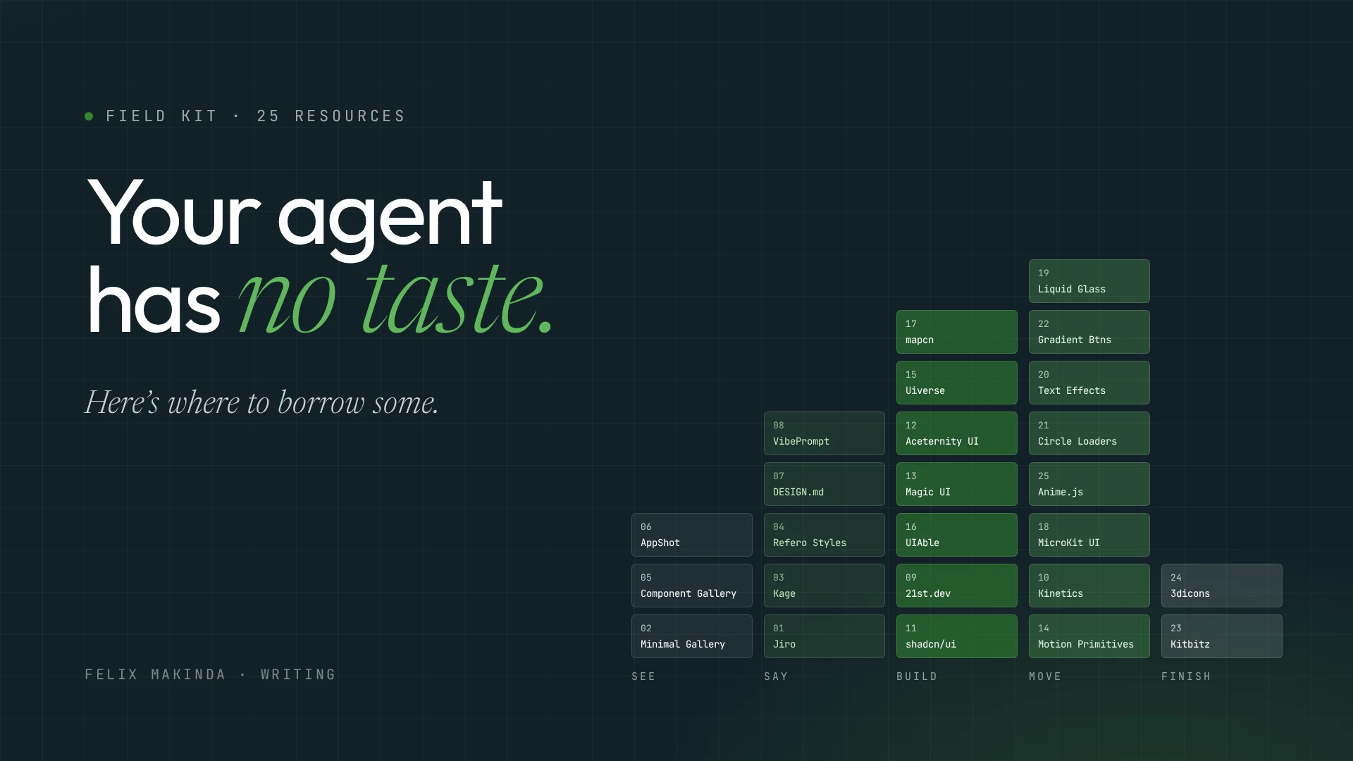
So the real skill in vibe coding interfaces isn't prompting harder. It is feeding the agent references. A list of 25 resources has been going around for exactly this purpose. Rather than reshare it, I opened every one of them, corrected what the list got wrong, and sorted them by the job they actually do. Bookmark this page and come back when you start your next build.
The five jobs#
Good interface work, with or without AI, moves through five stages. Each resource below belongs to one of them:
- See. Look at excellent real work until you know what you want.
- Say. Turn that taste into words and files an agent can read.
- Build. Assemble from components that are already right, instead of letting the agent invent them.
- Move. Add motion and micro-interactions, with restraint.
- Finish. Bring in illustrations and icons that make it yours.
Most generic AI output comes from skipping straight to stage three with nothing from stages one and two. Let's go in order.
1. See: train your eye before you train the agent#
You can't ask for what you can't recognise. These three are for looking.
Minimal Gallery is a hand-picked gallery of modern websites, with new sites added daily. Spend twenty minutes here before you write a single prompt. Screenshot the three sites that make you stop scrolling, and you now have something far better than an adjective to give your agent.
The Component Gallery is a reference of interface components drawn from real design systems. Look up "tabs" or "date picker" and you see how dozens of mature systems solved the same problem. This is how you learn that a component has decisions inside it: spacing, states, keyboard behaviour. Your agent will happily skip all of them unless you name them.
AppShot Gallery is narrower than its name suggests. It collects App Store screenshots, the marketing images on a store listing. If you are shipping a mobile app, this is where you study how good teams sell an app in five frames.
The lesson: the gap between generic and good is mostly the gap between "make it modern" and "make it feel like this." Collect the this first.
2. Say: translate taste into something an agent can read#
Here is the problem every vibe coder hits. You know exactly how the site should feel, and you cannot describe it. "Clean but warm" means nothing to a model. Colours, type scales, spacing values and named patterns mean a great deal. This group of tools exists to bridge that gap, and it is the most important group on the list.
Jiro is a design prompt library. You browse a real design, copy its prompt, and paste it into your coding tool. Read the prompts even when you don't use them: they teach you the vocabulary a model responds to.
Kage does something similar from the other direction. It shows interfaces from real products and turns any one of them into a prompt for Claude Code, Codex or Cursor.
Refero Styles is where this gets serious. Each entry is a real website's style broken down into colours, typography and spacing, alongside an AI-readable DESIGN.md file. That file is the key idea of this whole section.
DESIGN.md is a community library of exactly those files: hundreds of free design systems written as Markdown for Cursor, Claude Code and other agents.
Why does a Markdown file beat a clever prompt? Because a prompt is read once, but a file in your repository is read on every task. Drop a DESIGN.md at the root of your project and every component the agent writes, today and in three weeks, is pulled towards the same palette, the same type scale and the same spacing. You have stopped steering the agent one prompt at a time and started giving it a constitution. A minimal one looks like this:
# Design system

## Colour
- Ink #132128 for text, paper #FFFFFF for surfaces
- One accent, emerald #338632, used only for actions and emphasis

## Type
- Display: Outfit, tight tracking, sizes 48 / 64 / 96
- Body: Inter 17px, line-height 1.6

## Rules
- No gradients on surfaces. No drop shadows larger than 12px.
- Every interactive element has hover, focus and disabled states.
VibePrompt rounds out the group with layout prompts and ready-to-paste Tailwind snippets for every common page section: heroes, pricing, FAQs, dashboards. It is most useful once your DESIGN.md exists, because then the snippet inherits your system instead of its own.
The lesson: adjectives are noise to a model; values are signal. Write your taste down as values, put it in a file, and let the agent read it every time.
3. Build: don't let the agent invent a button#
An agent writing a dropdown from scratch will get the happy path right and miss focus trapping, escape-to-close, screen reader labels and the edge where the menu runs off the screen. A good component library has already been through all of that. Your job is to choose parts, not generate them.
shadcn/ui is still the foundation. Its big idea is that you don't install a dependency, you copy the component's code into your project, so you own it and can change anything. That ownership is what makes it so good with agents: the code is right there in your repo for the model to read and adapt. If you use only one resource on this list, use this one.
21st.dev is a registry of more than 12,000 React and Tailwind components, templates and shadcn themes from design engineers, each installable with one command and built with AI agents in mind.
UIAble is a complete design system built on shadcn: components, blocks, templates and dashboards. Reach for it when you need a whole admin panel, not a single widget.
Magic UI and Aceternity UI sit at the expressive end. Aceternity offers more than 200 copy-paste components and templates built with Tailwind and Motion; Magic UI is aimed squarely at making landing pages look striking. They are wonderful, and they are also the reason so many AI-built landing pages look alike. Use one signature piece per page, not five.
Uiverse is a large, community-built collection of open-source UI elements in plain CSS and Tailwind. It is a good place to find a single unusual checkbox or toggle without adopting a framework.
mapcn solves a problem most lists ignore: maps. It provides accessible, customisable map components built on MapLibre GL and styled with Tailwind, and it fits straight into a shadcn project. Markers, routes and popups without wrestling a mapping SDK.
The lesson: your agent's best work is composition. Give it trustworthy parts and a design file, and ask it to assemble. Ask it to invent the parts too and you inherit every bug it didn't think of.
4. Move: motion is a budget, not a garnish#
Motion is where interfaces start to feel alive, and where they most often start to feel cheap. The rule I follow: every animation must either explain something (where did this panel come from?) or confirm something (yes, your click registered). Anything else is spending the user's attention.
Motion Primitives is an open-source kit of animated components for React, Next.js and Tailwind. A sensible default layer of polish.
Kinetics is a library of spring-driven micro-interactions. You copy the CSS or React and tune the physics. Springs feel natural because they behave like objects with weight, which is why good interfaces have quietly moved away from fixed-duration easing.
MicroKit UI offers 49 free microinteractions for React, CSS and Tailwind (buttons, hovers, tabs, inputs), MIT licensed, with nothing to install.
Anime.js is a fast, lightweight JavaScript animation engine. Use it when you need choreography the component kits don't cover: timelines, staggered sequences, SVG paths.
Circle Loaders is a small, beautiful set of twenty-four monochrome loading animations in pure CSS and SVG, designed as agent-status indicators. With so many products now waiting on a model to think, a loader that looks considered is no longer a detail.
CSS Text Effects has 99 pure-CSS text animations, and Gradient Buttons has hundreds of gradient button styles you copy in one click. Treat both as spice. One glitch headline can be a personality; three is a theme park.
Liquid Glass is the most technically interesting entry here: a headless React lens that brings Apple-style refraction to the web by refracting the live page itself, working across Safari, Firefox and Chrome with zero dependencies.
Whatever you choose, tell your agent one non-negotiable rule: respect prefers-reduced-motion. Some people get physically ill from motion on screen, and a single media query lets them opt out.
The lesson: decide the motion budget for the page before you browse. Then spend it where it explains or confirms, and nowhere else.
5. Finish: make it look like somebody made it#
The last ten percent of a design is often illustration and iconography, and it is where a site stops looking assembled and starts looking authored.
Kitbitz offers more than 2,000 hand-drawn illustrations as SVG and PNG, with Figma kits and an MCP connection, all under CC0, so they are free for commercial use. Hand-drawn work is a good antidote to the polished sameness of generated interfaces.
3dicons is an open-source library of more than 1,440 3D icons, free for personal and commercial use without attribution.
Always read the licence before you ship an asset, even a free one. Both of these are generous, which is exactly why they are worth knowing.
A workflow that puts it together#
Here is how I'd use the list on a real project, start to finish:
- Spend twenty minutes in Minimal Gallery and Refero Styles. Save three references.
- Take the closest DESIGN.md from Refero or designmd.ai, edit it to your brand, and commit it to the root of the repo.
- Set up shadcn/ui, then pull blocks from 21st.dev or UIAble for the structure.
- Choose one expressive piece from Aceternity or Magic UI for the hero. Only one.
- Add motion from Motion Primitives or Kinetics, inside a stated budget, with reduced motion respected.
- Finish with illustrations from Kitbitz or icons from 3dicons.
- Then do the part no library does for you: open it on a real phone, tab through it with a keyboard, and read every line of copy out loud.
That last step matters more than any tool here. I wrote earlier about how vibe coding risks repeating the software crisis, when output outran understanding. Interfaces are no different. These resources make it cheap to produce something beautiful, but the judgement about what belongs on the page is still yours.
Bookmark table#
| # | Resource | Stage | Reach for it when |
|---|---|---|---|
| 1 | Jiro | Say | You can picture the design but can't describe it |
| 2 | Minimal Gallery | See | You need references before you start |
| 3 | Kage | Say | You want a real product's UI as a prompt |
| 4 | Refero Styles | Say | You want a site's style as a DESIGN.md |
| 5 | The Component Gallery | See | You need to see how systems solve one component |
| 6 | AppShot Gallery | See | You are designing App Store screenshots |
| 7 | DESIGN.md | Say | You want a ready design system file for your agent |
| 8 | VibePrompt | Say | You need a section prompt or Tailwind snippet |
| 9 | 21st.dev | Build | You want an installable component fast |
| 10 | Kinetics | Move | You want spring-physics micro-interactions |
| 11 | shadcn/ui | Build | Always. Start here |
| 12 | Aceternity UI | Build | You need one signature animated section |
| 13 | Magic UI | Build | You are polishing a landing page |
| 14 | Motion Primitives | Move | You want a default layer of animated components |
| 15 | Uiverse | Build | You want one unusual element in plain CSS |
| 16 | UIAble | Build | You need dashboards and full templates on shadcn |
| 17 | mapcn | Build | You need maps, markers or routes |
| 18 | MicroKit UI | Move | You want small copy-paste microinteractions |
| 19 | Liquid Glass | Move | You want real glass refraction on the web |
| 20 | CSS Text Effects | Move | One headline deserves a personality |
| 21 | Circle Loaders | Move | Your product waits on an AI and should look calm doing it |
| 22 | Gradient Buttons | Move | You want a gradient button without fiddling |
| 23 | Kitbitz | Finish | You want free hand-drawn illustrations |
| 24 | 3dicons | Finish | You want free 3D icons |
| 25 | Anime.js | Move | You need custom timelines and choreography |
Your agent will never have taste of its own. It doesn't need to. It needs yours, written down, and a good set of parts to build with.